The Ko Rongowhakaata: The Story of Light and Shadow identity, 2018. Photo by Maarten Holl.
The story behind the Ko Rongowhakaata typeface, Te Papa, June 2018
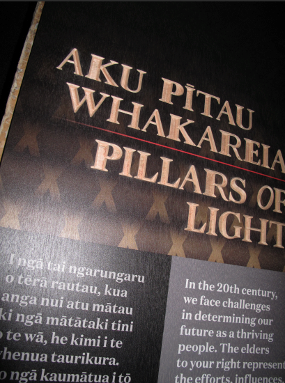
The typeface used in the exhibition Ko Rongowhakaata: The Story of Light and Shadow was developed in 2017. But its origins date back to the early 1800s, and is intimately connected to the iwi. Here is its story, told by Te Papa graphic designer Wol Jobson and Rongowhakaata’s Karl Johnstone.
Two of Rongowhakaata’s great carvers were Raharuhi Rukupō and Te Waaka Perohuka. Both were chiefs and tohunga whakairo (master carvers), and their creative spirit and innovation was an essential aspect of their leadership.
In the 1800s, Rukupō, Perohuka, and other carvers built the church at Manutūkē, and carved the renowned waka | canoe Te Toki-a-Tāpiri. Rukupō, alongside 18 other carvers, built and carved the meeting house Te Hau-ki-Tūranga, which you can see at Te Papa.
Te Hau-ki-Tūranga represents a high point of the great carving tradition of Tūranga – and of innovation. Rukupō, alongside 18 carvers, also embraced the potential of metal tools, creating a new and dynamic phase of Māori wood carving.
Rukupō could read and write, and saw how the written word could enrich customary knowledge keeping. He was the first to carve words, based on the Māori Bible typeface, into panels of wharenui | meeting house – the first Māori typographer. He also embedded the written word into carvings of ancestors.
The typefaces referenced by Rukupō were from the religious publications of William Colenso. In 1835, Colenso published the first printed material to come from the first printing press in New Zealand. In 1837, he produced the first of his 5,000 copies of William Williams’ Maori New Testament.
Colenso made his first overland trip down the East Coast of the North Island, from Hicks Bay to Poverty Bay, in 1838. His main objective was to find a mission site, but he also established contact with East Coast Māori. He took his religious publications with him.
The typeface
The typeface Colenso used in these religious publications was Caslon – probably Caslon Modern. This is the base for the Rongowhakaata typeface we developed for the exhibition.
Rukupō and type
Examples of Rukupō using type in his carving are in Te Hau-ki-Tūranga. Rukupō wasn’t random with these type forms – characters were consistent and patterns maintained.
Rukupō played with the widths of the type stems. With R, H, and P, the stems were thick. The N and O were often tilted. He saw each letter as a shape to be adopted and adapted.
Developing the Rongowhakaata typeface
Below are the developments of the typeface we created, referencing Rukupō and other Rongowhakaata artists’ type forms. The first is an open-face type. This was developed with a hand-chiselled, hand-crafted look.